
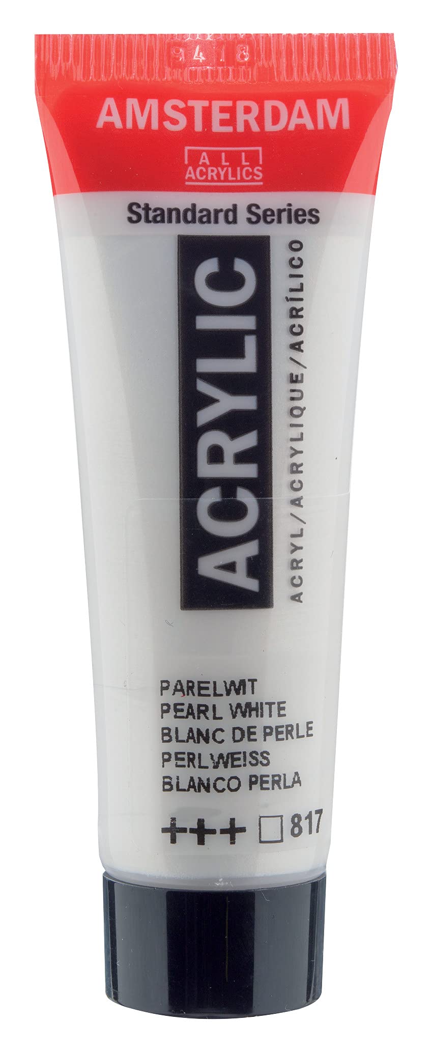
Amsterdam’s Standard Series acrylics occupy a particular spot in the market: student-to-intermediate paints made by Royal Talens, priced modestly, and sold in small 20ml tubes that suit occasional users and anyone building out a palette without committing to large quantities. The Pearl White 817 is one of the metallics in that line, and it behaves less like a workhorse white and more like a specialized mixing and accent color. Understanding that distinction matters before buying it.
The paint is a fluid, medium-bodied acrylic with a pearlescent finish rather than a flat opaque white. The metallic effect comes from mica-based pigments, which give it a soft sheen that shifts slightly depending on the angle of light. In practice, this means it reads as a warm, slightly off-white with a shimmer when applied straight from the tube, and as a subtle brightener when mixed into other colors. It dries to a satin-to-gloss finish, noticeably shinier than the matte colors in the same range, which is worth knowing if you are layering it into an otherwise flat painting.
Where this paint actually earns its place is in accent work. Thinned slightly with water, it works well for highlights on clouds, water surfaces, snow scenes, and still-life reflections, where a pure titanium white would look chalky or dead. Mixed into blues and greys, it produces muted, atmospheric tones with a faint glow that is hard to replicate with standard whites. It also holds up for decorative and craft applications: painting on canvas board, wood, papier-mâché, and similar porous surfaces, where the pearl effect is the point rather than an afterthought. Because it is an acrylic, it dries quickly and cleans up with water, which makes it forgiving for beginners and convenient for quick sessions.
Coverage is the main caveat. Pearl White is not a hiding white. Over dark or strongly colored grounds, a single pass leaves the underlying color visible, and building opacity takes several thin layers. Even then, the result stays translucent and shimmering rather than solid. Anyone expecting this to function as a general-purpose white for mixing tints or blocking in light areas will be disappointed; a standard opaque white does that job better and more cheaply. The metallic pigment also settles in the tube over time, so thorough shaking or stirring is necessary before use, and uneven mixing can leave streaks of concentrated shimmer.
Another trade-off is consistency across the line. The Standard Series is formulated for affordability, and the pigment load reflects that. Compared with artist-grade metallics, the pearl effect here is gentler and less intense, and the paint can feel slightly thinner straight from the tube. For studies, sketchbook work, and decorative pieces, that is entirely adequate. For archival fine-art work where the metallic quality is central to the piece, a professional-grade interference or pearl acrylic will give a stronger, more predictable result, at a correspondingly higher price.
The 20ml tube size is a sensible choice for this particular color. Pearl White is rarely used in volume, so a small tube lasts a long time for most painters and avoids the risk of a large quantity drying out between projects. The flip-top cap is practical, though like most acrylic tubes, the threads accumulate dried paint and need occasional cleaning to seal properly.
Compared with a generic craft metallic acrylic, this sits a step above in handling and mixing behavior, with better integration into a fine-art palette, though it is not dramatically different in effect. Compared with an artist-grade pearl white, it is clearly the more modest product, with less pigment density and a softer sheen.
Suitable for: students and hobby painters, decorative and craft work, landscape and still-life accents, and anyone who wants a subtle metallic white for mixing without buying a large tube.
Not suitable for: painters needing an opaque mixing white, professionals requiring strong archival metallic effects, or anyone expecting the shimmer to survive heavy layering or varnishing without dulling.
At its price, the Pearl White 817 is a reasonable, low-risk addition to a palette. It is a niche color that does one thing competently rather than a versatile staple, and it should be bought with that expectation in mind.